Blue & Red
Tue Mar 10, 2015 11:49 am
Re: Blue & Red
Tue Mar 10, 2015 11:58 am
Since this has been a major topic in the Tan era, I ask if Blue & Red as a combo make sense?
A colour strategy is like a recipe for harmony - a set of colour relationships that are proven to work well and can be used as a formula for building our colour composition.
A colour strategy is like a recipe for harmony - a set of colour relationships that are proven to work well and can be used as a formula for building our colour composition.
Re: Blue & Red
Tue Mar 10, 2015 12:06 pm
The colour blue - that is my colour - and the colour blue means you have left the drabness of day-to-day reality to be transported into - not a world of fantasy, it's not a world of fantasy - but a world of freedom where you can say what you like and what you don't like. This has been expressed forever by the colour blue, which is really sky blue.
Nice quote from the Arts world
Nice quote from the Arts world
Re: Blue & Red
Tue Mar 10, 2015 12:08 pm
You put a blob of yellow here, and another at the further edge of the canvas: straight away a rapport is established between them. Colour acts in the way that music does.
well I did like yellow trims in the 90s designs
well I did like yellow trims in the 90s designs
Re: Blue & Red
Tue Mar 10, 2015 12:12 pm
Good colour really means good taste; and 'powerful' colour means a reserve, to give a climax its full force, and not 'red, white, and blue all over.
hey! calm down mate nothing wrong with our kit

hey! calm down mate nothing wrong with our kit
Re: Blue & Red
Tue Mar 10, 2015 12:13 pm
There is a logic of colours, and it is with this alone, and not with the logic of the brain, that the painter should conform.
Agreed, Blue & red on the same kit doesn't work
Agreed, Blue & red on the same kit doesn't work
Re: Blue & Red
Tue Mar 10, 2015 12:23 pm
How lovely yellow is! It stands for the sun. Vincent Van Gogh
There is no blue without yellow and without orange, and if you put in blue, then you must put in yellow, and orange too, mustn't you? Oh well, you will tell me that what I write to you are only banalities. Vincent Van Gogh
There is no blue without yellow and without orange, and if you put in blue, then you must put in yellow, and orange too, mustn't you? Oh well, you will tell me that what I write to you are only banalities. Vincent Van Gogh
Re: Blue & Red
Tue Mar 10, 2015 12:28 pm
Red protects itself. No colour is as territorial. It stakes a claim, is on the alert against the spectrum.
Re: Blue & Red
Tue Mar 10, 2015 12:32 pm
ThomasC wrote:Red protects itself. No colour is as territorial. It stakes a claim, is on the alert against the spectrum.
I like what you have presented here.
Re: Blue & Red
Tue Mar 10, 2015 12:44 pm
Jupiter wrote:ThomasC wrote:Red protects itself. No colour is as territorial. It stakes a claim, is on the alert against the spectrum.
I like what you have presented here.
thanks
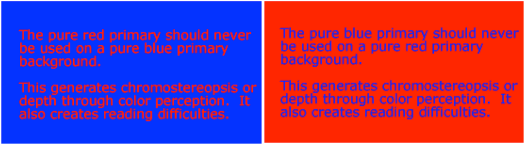
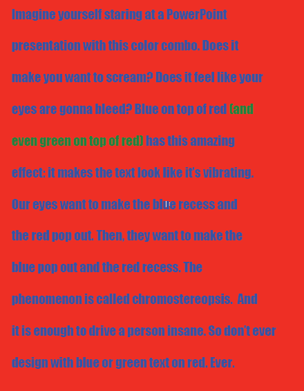
 went off on one, wasn't sure if anyone would like, I got interested in a subject this morning that is actually quite complex. Colour, what it means to people.
Re: Blue & Red
Tue Mar 10, 2015 12:46 pm
Blue has no dimensions; it is beyond dimensions, whereas the other colours are not... All colours arouse specific associative ideas... while blue suggests at most the sea and sky, and they, after all, are in actual, visible nature what is most abstract.
This is why I like Blue, it's abstract. The colour of my football team, It can mean so many things to different people.
This is why I like Blue, it's abstract. The colour of my football team, It can mean so many things to different people.
Re: Blue & Red
Tue Mar 10, 2015 12:48 pm
Two colours are enough, just blue and white - more might be a nightmare. (Jennifer Kostuik)
Re: Blue & Red
Tue Mar 10, 2015 12:51 pm
Of all the hues, reds have the most potency. If there is one electric blue, a dozen reds are so charged. Use them to punctuate white, burn into bronzes, or dynamite black.
They got it spot on with our Swansea City Away kit then
They got it spot on with our Swansea City Away kit then
Re: Blue & Red
Tue Mar 10, 2015 12:53 pm
Blue is the male principle, stern and spiritual. Yellow the female principle, gentle, cheerful and sensual. Red is matter, brutal and heavy and always the colour which must be fought and vanquished by the other two
Re: Blue & Red
Tue Mar 10, 2015 12:54 pm
A certain blue enters your soul. A certain red has an effect on your blood-pressure.
Re: Blue & Red
Tue Mar 10, 2015 12:55 pm
The end
Re: Blue & Red
Tue Mar 10, 2015 4:47 pm
ThomasC wrote:The end
...
Thank FCK for that i was going colour blind reading it! Never mind going loopy trying to follow what you wrote!
Re: Blue & Red
Tue Mar 10, 2015 4:50 pm
pembroke allan wrote:ThomasC wrote:The end
...
Thank FCK for that i was going colour blind reading it! Never mind going loopy trying to follow what you wrote!
don't know what happened this morning I do come to the conclusion that Blue & Red are not compatible colours, hence why the new badge looks strange
Re: Blue & Red
Tue Mar 10, 2015 5:03 pm
Blue white and yellow go much better together.
Obviously.
Obviously.
Re: Blue & Red
Tue Mar 10, 2015 5:20 pm
Buchanan's Exocet wrote:Blue white and yellow go much better together.
Obviously.
Exactly why I haven't celebrated a poor design of my team's football crest. Saying it is average is being too kind to the designer of it.
Re: Blue & Red
Tue Mar 10, 2015 6:52 pm
Disregarding Cardiff City, there's nothing wrong with blue and red. Your original post doesn't apply to everything, only blue lettering over the top of a red background.
There's nothing wrong with the Palace, Spain, or Barcelona kits
But regarding City, blue and red doesn't go to together purely because of our history.
There's nothing wrong with the Palace, Spain, or Barcelona kits
But regarding City, blue and red doesn't go to together purely because of our history.
Re: Blue & Red
Tue Mar 10, 2015 7:06 pm
JonCCFC wrote:Disregarding Cardiff City, there's nothing wrong with blue and red. Your original post doesn't apply to everything, only blue lettering over the top of a red background.
There's nothing wrong with the Palace, Spain, or Barcelona kits
But regarding City, blue and red doesn't go to together purely because of our history.
Fair points Jon, got me on the Barca and Palace kits!

Re: Blue & Red
Tue Mar 10, 2015 9:06 pm
Can't understand people who say red is not part of Cardiff City History... Check out the early 60's and early 90's kits... We had elements of red way before Tan got involved...
http://www.historicalkits.co.uk/Cardiff ... f_City.htm
http://www.historicalkits.co.uk/Cardiff ... f_City.htm
Re: Blue & Red
Tue Mar 10, 2015 9:42 pm
Riot_City_Bluebird wrote:Can't understand people who say red is not part of Cardiff City History... Check out the early 60's and early 90's kits... We had elements of red way before Tan got involved...
http://www.historicalkits.co.uk/Cardiff ... f_City.htm
Correct. However some of us like the yellow element we had before Tan got involved.
Re: Blue & Red
Tue Mar 10, 2015 10:17 pm